I've never really considered myself to be the "jealous" type. Sure I'm a little envious when I see Bryan's Cutch collection, Gavin's Mike Trout autographs, Greg's Pee Wee Reese, or Jim's incredible Hall of Fame collection. But deep down inside I'm just glad that they've taken the time to show them off on their blogs, so we all can appreciate them.
Plus if I really, really, really wanted to... I could sell off some cards and pick up most of the singles I want out there as long as they were available for sale and weren't five figures or more.
On the other hand... there is one thing I can't buy... that many of you out there have. And that's a better memory.
Whenever I read a post about someone's first baseball game attended or the first card they pulled out of a pack... I'm the guy who always responds "I wish I could remember that". I have plenty of childhood memories, but specific things like that have slipped my mind over the years. That's one of the reasons I continue to blog. It helps me document new "firsts".
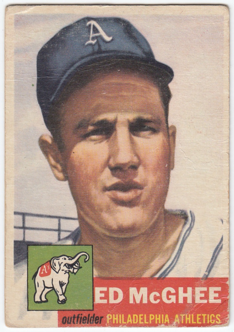
1953 Topps #195
I've been collecting for forty years, have worked at two card shops, and have accumulated 100's of thousands of cards over that time... but this card represents the first 1953 Topps baseball card I've ever owned.

I've always had mixed emotions on this set. Although I like the overall look of them the 1953 Topps set failed to crack the Top 16 when I ranked my favorite Topps flagship designs in 2016. Now that I'm staring at one in real life, I think I might need to go back and revise my list. But today let's just appreciate the beauty of this sixty-eight year old piece of cardboard.

It all starts with the gorgeous portrait painting of Mr. McGhee. I was really impressed with the shadows, forehead wrinkles, and double chin the artist included.

I also love the old Philadelphia Athletics logo with the white elephant and A's logo on its back. Although it seems to be missing the baseball the elephant normally grasps with its trunk. Speaking of baseballs...

As Night Owl pointed out a few weeks ago... Topps nailed the stitching on their 1953 baseball cards. If I was ever going to design a card, it would definitely include the card number within a baseball on the back.

I'd also make sure it included a cartoon that included an interesting fact about the player or a piece of baseball trivia for fans. I remember buying Eagle Claw fishing hooks when I was a kid, but never knew it was another name for baseball glove.
As for Warren Edward McGhee...

He seems to be famous for being part of the deal that sent Ferris Fain to Chicago in January of 1953. At the time of the trade, Fain was a 3x AL All-Star and had won back to back batting titles for the Athletics in 1951 and 1952. Not exactly sure what role McGhee played in the trade... but the key piece that A's received in return was Eddie Robinson.
Thank you Bob for sending me my very first 1953 Topps baseball card. It's hard to quantify how much joy I received holding this card in my hand, but I assure you that I truly cherish it.
But wait... there's more. He also sent me over 50 other A's cards in his care package. The cards ranged from vintage to 80's minor league cards to 90's inserts. Here's a sampling:


2015 Topps Chrome Refractor Autograph #AR-KG
Rounding out Bob's care package were some wild cards:


The 1985 Topps Renata Galasso card of Pete Rose has a great looking action shot, but my favorite "wild card" was Audrey Quock rookie card. No idea who she is... but she kinda reminds me of Pete's girlfriend.
Thanks again Bob! You have a very specific list of things you collect... but I think I can find a few items to send your way. If not... I'll have to do a little shopping.
As for the rest of y'all...
Where does the 1953 Topps rank among their flagship baseball card designs?
I'll have to put some thought into it... but I'm thinking it'll land somewhere in the Top 12 to Top 15 range.
Happy Monday and sayonara!
12 comments:
It's a top 5 set all-time for me, and I WILL complete it someday! My current pipe dream target card is a '53 Mays in a PSA slab. I love all 274 subjects in the set though, you really can't go wrong, glad you have one in your collection at last!
Terrific card. I like '53 Topps as well, and it's the reason I collect the Topps Living Set cards.
A long time ago, when I was a teenager, a guy gave me a stack of '53 Topps cards, however, they're all cut down, with , I'm guessing, a pair of scissors, by some kid back in the day.
Keep on Bloggin'!
I rank all the vintage cards together as being equal. Sure, I think some are better than others, but until I have them all, I'm just happy to get some.
For me 1953 isn't quite top tier, but it's not too far behind. Many of the paintings are really quite good. The autograph over the back text is an interesting design element, although in some cases it can make the text a bit hard to read.
any set that has hand created cards, meaning...not photos...i'm completely in love with. I do love the simplicity of the card design and appreciate the detail on the back as well. not sure where i'd rank this set though...
I ranked '53 Topps, eighth overall here:
http://nightowlcards.blogspot.com/2015/12/night-owls-all-time-topps-set-countdown.html
That was quite the jump from where I'd rank it back when I was younger. I didn't much like the painted look then.
I've been looking for a word to describe Bob's tastes. "Specific" definitely sums it up.
I think I ranked '53 Topps somewhere in the low-20s all-time when I did my Topps countdown. It's not that bad of a design -- it just has the misfortune of being surrounded by other '50s designs I like way more, and the fact that it's been rehashed to death by Topps over the years (Living Set, etc.).
I rank it high because it has so many iconic cards. One knock for against it is the dang size.
I have a shitty memory myself. You’re not alone!
I rank it the highest of the "oversized" vintage cards topps issued prior to 1957. I was super disappointed in 1991 when topps issued the "ultimate" 1953 set in standard card size but used photos instead of paintings for the cards of players who were missing from the original set.
Definitely one of the nicer looking 1950s sets, no doubt. I do love the portraits and I know they are quite popular, but not sure it would crack the top 10 on my list.
Never really liked the 53s. They're nice enough but have always felt overrated in the way that Topps returns to that well over and over and over again. What I *do* like though are the cards with fun easter eggs in the backgrounds like Topps advertisements or player names hidden in the artwork.
Post a Comment