
Last week, I received a padded envelope from David over at Card Boredom. If you're not familiar with his blog, he's a collector who built the 1993 Finest refractor set and is currently working on the iconic 1952 Topps set.
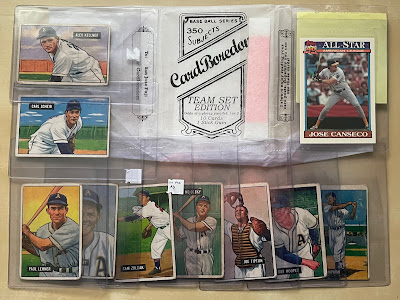
He sent me two custom wax packs. Each pack contained ten cards and a stick of bubble gum just like the good old days. He had given me some clues as to what he sent my way, but obviously I had no idea he was sending me a complete A's team set from my favorite Bowman set of all-time.
I'll stop writing now and let the scans and photos do the talking...


1951 Bowman #120


On April 30th, 1951... Brissie was traded to the Indians as part of three team deal that involved Minnie Minoso going to the White Sox and several players in this team set arriving from Cleveland and Chicago.
I was so excited to get these scans up onto my website and into this blog post that I only had time to scan one card back for all of you to see:

Not exactly the most exciting card backs of all-time. But these were introduced to collectors almost seventy-five years ago, so I think it deserves a free pass.
Pack #1:


1951 Bowman #8
1951 Bowman #9
1951 Bowman #33


1951 Bowman #57
1951 Bowman #82
1951 Bowman #83


1951 Bowman #84
1951 Bowman #114
1951 Bowman #119
That's the first half of the team set. Bowman used color reproductions of actual photos on these cards and paired them perfectly with white borders and the black name box. Definitely not boring. In fact, they truly belong in a baseball museum.
If you look at the wax wrapper carefully, you'll notice that he included one glossy parallel in every other pack. Here's the one I received:

1991 Topps Tiffany #390
You can't tell from the scan, but Canseco indeed has glossy borders to go along with this bubble gum pink card back:

Definitely not boring.
Pack #2:


Here's a closer look at these beautiful Bowmans...


1951 Bowman #120
1951 Bowman #154
1951 Bowman #191


1951 Bowman #226
1951 Bowman #227
1951 Bowman #261


1951 Bowman #262
1951 Bowman #297
1951 Bowman #298
According to TCDB, there are only eighteen cards in the Philadelphia Athletics team set. However David tossed in the Lou Brissie too:

1951 Bowman #155
I was so excited to get these scans up onto my website and into this blog post that I only had time to scan one card back for all of you to see:

Thank you David for this very generous care package and for helping me kick off the week on the highest note possible. It's not every day that I get the opportunity to add a vintage team set to my A's PC.
Happy Cesar Chavez Day and sayonara!


